The Amazon app is getting a makeover. You may have already spotted the refreshed version of the Amazon shopping app with its new color scheme and revamped navigation if you’re an iPhone user. The changes began rolling out earlier this summer to iOS users in the U.S. and are on track to reach 100% of the U.S. mobile customer base on iOS by the end of this month. Other markets will see the updates arrive later this year and an Android release will then follow.
The company had not yet publicized the changes to its shopping app, but confirms the iPhone updates are a part its larger plan to make it easier to direct mobile users to their most-used features.
Amazon says the new version of the app will initially be available to customers in the U.S., Canada, Europe, China, Japan, and Central and South America, before reaching other markets.
Image Credits: Amazon app/screenshot by TechCrunch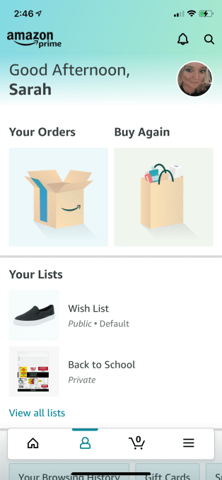
You may first notice the Amazon app seems brighter, thanks to a change that standardizes the app’s top navigation bar to a new blue-green gradient. However, the bigger changes are focused on how the app works, not the colors it uses.
The redesign’s larger aim, Amazon explains, was to make it easier for users to find what they are looking for — even when they’re using their iPhone with one hand, as is common.
As you move through the updated app, you’ll notice a new “Quick Access” bar floating on the bottom of the screen that offers shortcuts to the most frequently accessed features. This bar provides links to the app’s Home page, where you’ll find your personalized shopping recommendations, program offers and other seasonal content. The second button, a profile icon, takes you to your account page where you’ll find your orders, lists, account options, and previously browsed and searched items.
With the third button, you can access your Amazon cart, where you’ll also find your orders and your “Buy Again” suggestions.
Finally, for those trying to navigate elsewhere in the Amazon app with one hand, the new Quick Access bar features its own “hamburger” menu (the three horizontal lines), where you can browse and discover other Amazon departments and programs, including deals, Whole Foods, and your Alexa Shopping List, among others.
Image Credits: Amazon app/screenshot by TechCrunch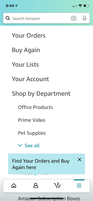
The links listed in the navigation section are much larger than before, too, for easier reading on small screens.
Unfortunately, what Amazon hasn’t yet figured out how to manage its ever-growing list of “Programs & Features.” Today, this section of the app still somewhat randomly combines Amazon’s various initiatives like Treasure Truck, Subscription Boxes, curated collections (like Made In Italy or Amazon Launchpad), social features (like #FoundItOnAmazon), as well as its services like Amazon Fresh, Amazon Pantry, and others alongside links for physical destinations. (Amazon Go, for some reason, gets its own link, instead of being featured under Amazon Physical Stores.
Even the navigation’s name, the vague and all-encompassing “Programs & Features,” hints at a lack of organization. It’s also unclear why Amazon lists some things in both this section and in “Departments,” like Amazon Fresh. Meanwhile, others, like Amazon’s Handmade section, only gets one listing.
But Amazon likely has a plan in mind when it makes such choices. Online grocery, for example, is helping drive e-commerce sales amid the pandemic. It can’t hurt, then, to make Amazon’s grocery services easier to find by putting a link everywhere — including, of course, at the top of the home screen in the main navigation row.
Here, Amazon highlights its key features: Whole Foods, Fresh, Alexa Lists, Prime, Video, and Music. (Imagine how much screen real estate could be freed up if Amazon could only figure out how to consolidate its online grocery business into one service instead of two!)
Image Credits: Amazon app/screenshot by TechCrunch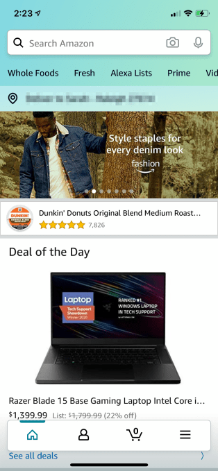
Other areas of the app received layout changes in the redesign, as well.
At the top of the screen, for example, the app features a simplified navigation bar where you can quickly tap to perform a search using text or your camera or engage with Alexa.
An Amazon spokesperson confirmed the details and timeframe of its launch plans for the new app with TechCrunch.
“The new design for Amazon’s app on iPhone provides customers easier access to the features they use most, while on the go. This includes the homepage, account and order information, their cart and the ability to browse and discover Amazon departments and programs,” the spokesperson said.
The retailer has yet to update its App Store listing to showcase the app’s new look-and-feel, which, for reference, is displayed below.
Image Credits: Amazon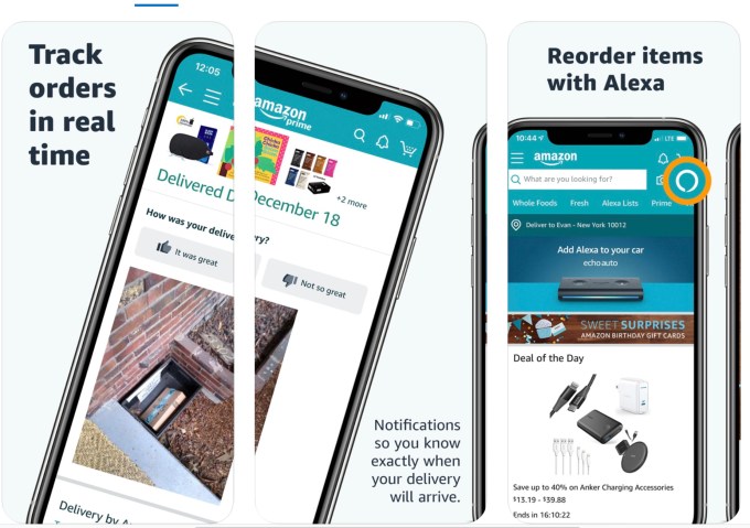
Not every mobile makeover deserves attention, but this revamp is one of Amazon’s bigger updates to date — especially as it’s entirely moved its main navigation and even changed its brand’s color scheme. (Well, except for the app’s icon, which still features the classic, darker shade of blue.)
It’s also notable because Amazon’s app is one of the largest on iPhone, often in the top 20 in the U.S. App Store. It’s currently the No. 26 Overall app in the U.S., as of the time of writing.
